

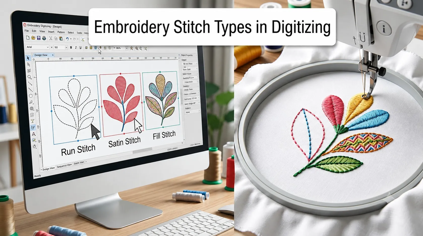
Every embroidered design, no matter how detailed, is built from a small handful of stitch types. That surprises people. A jacket back with a dragon and lettering and shading looks like it must use dozens of techniques, but underneath it is mostly three stitches doing different jobs, plus a few specialty variations layered on top.
Knowing these stitch types is the difference between a digitized file that sews clean and one that puckers, snags, or turns your lettering into a smudge. If you are learning to digitize, or you just want to understand what your digitizer is actually doing when you hand over a logo, this is the vocabulary you need. Here is every stitch type that matters, what each one is for, and where each one falls apart if you use it wrong.
First, what counts as a stitch
In machine embroidery, one stitch is one needle penetration. The needle comes down, the bobbin thread locks the top thread in place underneath, and the needle comes back up. A design with 8,000 stitches means the needle went through the fabric 8,000 times. That number, the stitch count, is what most digitizing services price on and what decides how long your design takes to sew.
The stitches themselves fall into three core types that do almost all the work, and a set of specialty stitches that are really just variations of those three. We will start with the big three, because if you understand them, everything else clicks into place.
The Three Core Stitch Types
1- Running stitch
The running stitch is the simplest one, a single line of stitches that runs from point to point, exactly like a straight stitch on a home sewing machine. It follows a path, so it is your tool for thin lines, outlines, fine detail, and small text that is too narrow for anything heavier.
It is also the workhorse behind two invisible jobs. Digitizers use running stitches for underlay, the foundation layer that goes down first to anchor the fabric, and for travel or connecting stitches that move the needle between design elements without cutting thread. Most of the running stitch in a finished design is doing quiet structural work you never notice.
Stitch length matters here. Keep a running stitch roughly between 1.25 mm and 7 mm. Go longer than that and the stitches start to snag and catch on things. Go much shorter and they pile up on top of each other, sink into the fabric, and disappear. Around 2.5 mm is a safe middle for most detail work, and the software will automatically shorten stitches around tight curves so the line stays smooth.
The tradeoff: a single running stitch is thin and not very durable on its own, which is exactly why the bean stitch below exists.
2- Satin Stitch
Satin is the glossy one. It lays thread back and forth across a column so the strands sit parallel and catch the light, giving that smooth, raised, shiny look. This is the standard for lettering, borders, outlines with weight, and any narrow shape that needs to look crisp and polished. When you see clean embroidered text on a polo, that is satin stitch.
The catch is width. Satin stitches span the full width of the column in one pass, so as the column gets wide, each stitch gets long and loose. Past roughly 10 to 12 mm the stitches are long enough to snag on anything rough and to shift out of place. On garments that get rubbed and worn, many digitizers keep satin columns even tighter, around 7 mm, to be safe. When a shape is wider than satin can safely handle, you either split the satin or switch to a fill.
On the other end, satin columns thinner than about 1 mm to 2 mm stitch on top of themselves and look messy, so very fine lines belong to the running stitch, not satin.
3- Fill Stitch (Tatami)
Fill stitch, most often the tatami pattern, is how you cover any area too big for satin. Instead of long spanning stitches, it lays down rows of shorter stitches in a repeating brick-like pattern, filling the shape with a flat, even, durable surface. Think of the solid body of a shield, a large background block, or the filled area of a logo.
Because tatami is built from many short rows, you can change its angle, density, and pattern to create texture, direction, and even subtle shading. That flexibility is why it is the go-to for large areas. The downside is stitch count. Fill eats thread and time, so it is the wrong choice for thin lines or tiny spots, where it wastes stitches and looks clumsy. Fill for big areas, satin for columns, running for lines. That single rule covers most digitizing decisions.
The Specialty Stitches
These are the variations that give designs their character. Each one is built on the core three, and each solves a specific problem.
Bean stitch, also called triple stitch, is a running stitch that retraces the same line three times, so it comes out bolder and stronger than a single pass. Digitizers reach for it when an outline needs weight without the bulk of satin, or when a thin line needs to survive real wear.
Zigzag stitch looks like a loose, open cousin of satin. The spacing between stitches is wider, which makes it useful for tacking down appliqué edges, adding flexible decorative borders, and reinforcing where two fabrics meet. Tighten the spacing all the way and a zigzag effectively becomes a satin stitch.
E-stitch, sometimes called the blanket or appliqué stitch, is the comb-shaped edge stitch that secures a piece of appliqué fabric to the base while leaving a clean, slightly decorative border. It is the standard finish for appliqué work and for many patch edges.
Column or steil stitch is a close relative of satin, built from shorter, tightly packed stitches for narrow borders and small detailed shapes where you want a defined, durable edge.
Cross stitch recreates the X-shaped hand embroidery look by machine, layering two diagonal stitches into that familiar grid pattern. It suits vintage-style designs, decorative patterns, and anything meant to echo hand-stitched cross stitch. It works best on tighter weaves and is not built for smooth shading.
Chain stitch produces a looped, rope-like line with a raised, textured, handmade feel. It shows up in decorative outlines and bold ornamental designs where you want dimension rather than a flat finish.
Jump stitch is not decorative at all. It is the long travel the needle makes between two separate parts of a design without stitching, usually trimmed away afterward. Good digitizing plans the stitch path to minimize jumps, which means fewer trims, fewer machine stops, and a cleaner back.
How Digitizers Choose Which Stitch To Use
Picking the stitch is not about which one looks nicest on screen. It is about matching the stitch to the job, the size, and the fabric.
A few rules that hold up in practice. Lettering and narrow columns get satin, kept under about 7 to 10 mm wide. Fine lines, small text, outlines, and underlay get running stitch. Bold outlines that need to stand up to wear get bean stitch. Large areas get fill, with the angle and density set to suit the shape. Appliqué edges get e-stitch or zigzag. And every one of these choices depends on the garment underneath, because a stitch plan that sews beautifully on a stable woven cap will pucker or sink on a stretchy knit or a fluffy fleece.
Two settings sit underneath all of it. Density controls how tightly the rows pack together, and getting it wrong causes either see-through gaps or a stiff, puckered patch that damages the fabric. Underlay, those light foundation stitches, holds everything stable so the top stitches sit where they should. Skip either one and even the right stitch type will fail.
The last rule is the one no software can replace: sew a test. The screen preview always looks better than the real thing, and the only honest judge of a stitch choice is a sample sewn on the actual fabric. Experienced digitizers stitch it out, inspect it, and adjust. That loop is where the craft lives.
Conclusion
Machine embroidery runs on three core stitches. Running for lines and detail, satin for smooth columns and lettering, fill for large areas. Bean, zigzag, e-stitch, column, cross, chain, and jump are variations that handle specific jobs on top of those three. A good digitized file is really just the right stitch, at the right size, at the right density, with proper underlay, chosen for the fabric it is going on.
If you are digitizing your own designs, learning when each stitch applies is most of the battle, and stitching everything out on real fabric teaches faster than any tutorial. If you would rather hand it off, that is what we do at Shine Digitizing. We choose and test the stitches by hand so your logo sews clean on the exact garment you are using, whether that is a knit polo, a structured cap, or a jacket back.
Frequently Asked Questions
Running stitch, satin stitch, and fill stitch (tatami). Running stitch handles thin lines, detail, and underlay. Satin stitch creates smooth, glossy columns for lettering and borders. Fill stitch covers large areas with a flat, durable surface. Almost every other stitch type is a variation of these three.
As a general rule, keep satin columns under about 10 to 12 mm, and closer to 7 mm on garments that get heavy wear. Wider than that, the individual stitches get long and loose enough to snag and shift. For anything wider, split the satin or switch to a fill stitch.
Satin lays long parallel stitches across the full width of a narrow column, giving a shiny raised look ideal for lettering and borders. Fill lays many short rows in a pattern to cover large areas with a flat, even, durable surface. Satin is for columns, fill is for big shapes.
A bean stitch, or triple stitch, retraces a running stitch line three times to make it bolder and more durable. Digitizers use it for outlines and thin lines that need extra weight or need to survive wear, without the bulk of a satin border.
Small lettering usually uses satin stitch, but only down to a workable size. Below roughly 4 to 5 mm tall, satin lettering fills in and becomes unreadable no matter the stitch. Very fine detail lines within or around text use running stitch instead. If your text is small, enlarge it or simplify it before digitizing.