

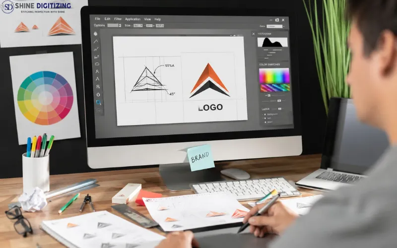
Your logo looks great on screen. That means almost nothing once a needle gets involved. An embroidery machine cannot sew a JPG or a PNG. It needs a stitch file, a set of instructions that tells the needle where to move, what stitch type to use, how dense to pack the thread, and when to trim or change color. Turning your logo into that file is called embroidery digitizing, and how well it gets done decides whether your logo comes out crisp on a polo or turns into a puckered blob.
This guide walks through the full process of digitizing a logo, step by step. It applies whether you plan to do the work yourself in digitizing software or you just want to understand what a professional digitizer does before you hand your artwork over.
Start With The Artwork, Not The Software
Most digitizing problems begin before any digitizing happens. The quality of your source file sets the ceiling for everything after it.
A clean vector file (AI, EPS, SVG, or PDF with vector data) is the best starting point because the shapes are sharp and easy to trace at any size. A high-resolution PNG or JPG on a plain background works too. A screenshot of your logo pulled off Facebook, blurry and 200 pixels wide, forces the digitizer to redraw the logo from scratch before the real work even starts.
While you are looking at the artwork, be honest about what thread can and cannot do. Gradients, drop shadows, and photographic detail do not translate to embroidery. Thread comes in solid colors and stitches have physical width. Tiny taglines under a logo are the most common casualty. Lettering below roughly 4 to 5 mm tall fills in and becomes unreadable, no matter how good the digitizer is. If your logo has small text, plan to enlarge it, thicken it, or drop it for the embroidered version.
Decide The Size & Placement First
Digitizing is size-specific. A file digitized at 3.5 inches wide cannot simply be scaled up to 10 inches later, because stitch density, underlay, and small details all stop working correctly outside a narrow range. So lock in the size before anyone touches the software.
The common placements have settled into standard sizes over the years. A left chest logo usually runs 3 to 4 inches wide. A cap front is limited by the curve and the hoop, so most cap designs stay around 2 to 2.5 inches tall. A full jacket back can run 10 to 12 inches. Each of these is a different digitizing job, even for the same logo.
Fabric matters just as much. A logo digitized for a stable woven twill cap will sew badly on a stretchy pique polo or a fluffy fleece hoodie. Knits stretch, fleece swallows thin stitches, and towels need extra foundation so the design does not sink into the loops. Tell your digitizer the garment, or if you are digitizing yourself, make every decision with that specific fabric in mind.
The same rules apply if your logo is headed for custom patches instead of direct embroidery, though patches forgive a little more since they sew on stiff twill rather than a stretchy garment.
The Digitizing Process, Step By Step
With artwork, size, and fabric settled, here is how a logo actually gets digitized. The software brands differ (Wilcom, Hatch, Embird, Brother PE Design, or the free Ink/Stitch plugin for Inkscape) but the process is the same everywhere.
- Import and scale the artwork. Bring the logo into the software and set it to the exact finished size. Everything you draw from here on is anchored to that size.
- Plan the stitch sequence. Decide what sews first, second, and last. The usual logic is background shapes first, details and outlines after, and lettering near the end. Good sequencing keeps the design registered, cuts down on trims, and reduces machine stops. Bad sequencing is why some logos have outlines that miss their fill by a millimeter.
- Assign stitch types to each element. Three stitch types do almost all the work in a logo. Running stitch handles thin lines and fine detail. Satin stitch covers borders and lettering, and it works best in columns from about 1 mm up to 10 or 12 mm wide. Fill stitch, also called tatami, covers anything larger, like the body of a shield or a solid background shape. Assign the wrong type, say satin on a wide area, and you get long loose stitches that snag on everything.
- Add underlay. Underlay is a light layer of stitches that sews down before the visible top stitching. It anchors the fabric to the stabilizer, stops shifting, and gives satin columns and fills a base to sit on. Different jobs call for different underlay: an edge walk under satin columns, a zigzag for wider columns, a light lattice under big fills.
- Set density and pull compensation. Density controls how tightly stitches pack together, and around 0.4 mm spacing is a common starting point for standard 40 weight thread on stable fabric. Pull compensation deals with a physical fact: thread pulls fabric inward along the direction of the stitch as it sews. Digitize a perfect circle with no compensation and it sews out as an egg. The fix is to widen shapes slightly along the axis of pull so the finished stitch out looks correct.
- Handle the lettering carefully. Text is the hardest part of most logos. Keep letters above the 4 to 5 mm minimum, use satin stitch, simplify serifs and thin strokes at small sizes, and check the spacing between letters so satin columns do not merge. If the built in keyboard fonts in your software look rough at your size, digitize the letters manually. Professionals often do.
- Set trims, tie offs, and color stops. Tie in and tie off stitches lock the thread at the start and end of each section so nothing unravels. Trim commands tell the machine to cut jump threads between sections. Color stops tell the machine, or the operator, when to change thread. Match your thread colors to a real chart from brands like Madeira or Isacord rather than guessing from the screen.
- Export to the machine format. Commercial shops mostly run DST, the Tajima format, which is the closest thing to a universal standard but carries no color data. Brother and Babylock home machines use PES. Janome uses JEF, Melco and Bernina use EXP, and Husqvarna Viking and Pfaff use VP3. Keep your editable master file too (EMB in Wilcom, for example), because that is the version you can reopen and change later. A DST is like a finished PDF. The master file is the layered source.
- Sew a test. This step is not optional. Run the file on fabric close to the final garment, with the same stabilizer, and look at it hard. Check the small text, check that outlines land where they should, check for puckering and gaps. Then go back into the software and fix what the needle exposed. One or two rounds of this is normal even for experienced digitizers.
The screen preview always looks better than reality. The stitch out is the only opinion that counts.
What About Auto-Digitizing?
Every modern package has a one-click auto-digitize button, and plenty of apps promise to convert any image into a stitch file instantly. For a simple, bold, single color shape on stable fabric, the results can be usable. For a real logo with small text, thin outlines, and multiple colors, they are consistently poor.
The reason is simple. Auto tracing reads pixels. It does not know your fabric stretches, does not know your tagline is too small to sew, does not plan a stitch path, and applies generic density and underlay everywhere. Digitizing a logo well is a long series of judgment calls, and the software makes none of them for you. Use auto digitizing as a rough starting point if you like, but expect to rebuild most of it by hand.
Should You Digitize Your Own Logo OR Hire It Out?
Learning to digitize is a real option. The software is accessible, Ink/Stitch is free, and simple designs are within reach after some weeks of practice and a pile of failed stitch-outs. If you enjoy the craft and have time to test and adjust, go for it.
Hiring a professional makes sense when the logo has small lettering, when a client is waiting, when the fabric is difficult, or when you simply cannot afford a redo. A skilled digitizer has already made every mistake you are about to make and prices the work accordingly, usually as a flat fee or by stitch count. At Shine Digitizing we digitize logos by hand and test sew the files before delivery, because a file that has never met fabric is a guess, not a product.
Conclusion
Digitizing a logo for embroidery comes down to a chain of decisions: clean artwork, a fixed size and fabric, a sensible stitch sequence, the right stitch types, proper underlay, realistic density and pull compensation, careful lettering, and a test sew to prove it all.
Software keeps improving, but none of those decisions have been automated well, which is why hand-digitized logos still sew noticeably better than one-click conversions. Whether you learn the craft or hire it out, at least now you know what a good stitch file requires, and why the cheap shortcut so often ends in puckered fabric and unreadable text.